Game changing trends in Web Design
They say all creativity is a conversation. As a digital medium, web design is far more subject to shifts in technology than its traditional print forbearers. A conversation that’s been ongoing right since we first learnt to recreate the elements of our world in ochre and charcoal on cave walls. The web is another wall that has evolved over time and gained popularity as the most significant hub of content online businesses that leave an indelible mark on their target audience.
And certain trends have emerged in that sprawling, chaotic, polyphonous conversation. Our creative choices exist along these trends as they provide context.
Let’s take a look at some notable website design trends poised to take over in 2018.
Traditional grid vs Asymmetry
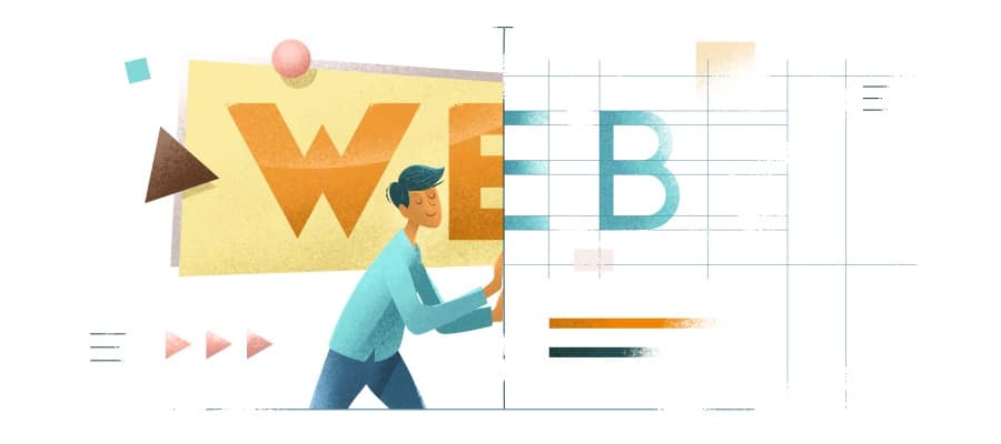
In the designers’ never-ending quest for more creative and engaging layouts, the introduction of asymmetrical and unconventional ‘broken’ layouts as a web trend will dominate in 2018. The appeal of the asymmetrical layout is that it is unique, distinctive and sometimes experimental.
In broken grid, the usual discreet boxes of images and text begin to overlap and converge, often creating beautifully unexpected juxtapositions of bitmap and letterform. Although large-scale brands with a lot of content still use traditional grid-based structures, you can expect an increase in the use of unconventional layouts across the web, as brands create unique experiences to set themselves apart.
Illustrations take center stage
Illustrations are great, versatile media for creating images that are playful, friendly and add an element of fun to a site. Illustrations can also be very powerful in bringing more abstract concepts to vivid life, as you can see in Shopify’s Polaris site. With a single drawing, Shopify clarifies that the Polaris design system is intended to serve as a guiding light — a north star — for every member of the team.
Brutalism reaches mainstream status
Brutalism …. is ripping open a space where designers can do what they want, rather than what they should- in favor of looks and effects that live in the jarring, and sometimes border on the offensive. It’s noteworthy to see how an ecommerce outlet jumped on the brutal bandwagon.
Bold colors
2018 is definitely the year for super vivid colors online. While in the past many brands and designers were stuck with web-safe colors, more designers are becoming courageous in their approach to color—including supersaturation and vibrant shades combined with headers that are no longer just horizontal but reimagined with slashes and hard angles.
The colors for this United Kingdom–based luxury property developer’s site add depth and a touch of luxury.
Even more pervasive interactions and animations
The web isn’t a static medium. At least some of the web’s message -its meaning lies in its capacity for motion and interactivity: the ability for a web page to not simply present us with information, but to make that information move and more importantly to allow us to interact with and impact that information.
We’re also seeing a ton of tools arise to simplify the creation of more complex animations and interactions- long a gap in the digital designer’s toolkit.
The site for Keego allows users to interact with the squeezable metal bottle as they learn more about it.
Big, bold typography- Serifs put their best feet forward
Typography has always been a powerful visual tool, able to create personality, evoke emotion and set tone on a website design all while conveying important information. You can now expect a huge increase in the use of custom fonts. The trend of large letters, contrasting sans serif and serif headings help create dynamic parallels, especially for headers and improve UX and best of all, keep the visitor reading your website.
Witness Lickstarter’s recent redesign, which features block quotes from creators set in a softly curving serif
Or the big, bold headlines of Reform Collective
While a scroll through Typewolf on just about any given day will reveal several serifs stealing the scene:
Mobile first
As mentioned earlier, mobile browsing has now officially surpassed desktop. Rather than large, beautiful images, icons are much more economical in the mobile version in terms of space and have become so common that the user has no trouble understanding them. And UX issues have become easier to identify and fix with micro-interactions getting you immediate feedback on your user’s actions. Therefore, everyone business is focusing on creating delightful responsive website design.
Flat vs gradient
Over the last few years, flat design has been a much preferred web design trend over dimensional colors, but gradients are making a big comeback in 2018. Now, gradients are big, loud and full of color. The most popular recent incarnation is a gradient filter over photos—a great way to make a less interesting image look intriguing. A simple gradient background can also be the perfect on-trend solution if you don’t have any other images to work with.
The video element
Video is here to reign for its seamless ability to be included in design /looped without losing quality and content.
Between the bright colors, bold gradients and integrated animations, 2018 is gearing up to be one of the most fun years in recent memory around the web.
Overall, last year was very much about web animations and micro-interactions, conversational interfaces and chatbots, design sprints and bespoke illustrations. Even an approach that rejected mainstream web design trends became a trend itself: brutalism.
All of these trends are going to grow in 2018. In fact, the subtle shift from UX design to digital service design is going to continue, and that we’re going to see much more interest in the field of service design from the digital sector this year.
Being one of the best website development agency in Dubai, at 7G media we create cohesive experiences for the user to impact their businesses effectively.


